It is easy to find claims that open data can change the world. It is a lot harder to find out exactly how that happens. We have examples of open data used in ways that lead to benefits for citizens. Growing more of those in a society-wide trend faces many challenges.
Building momentum for the release and use of open data is a chicken-and-egg problem. Open data is only valuable when it is used. You can only use open data if it’s released. Releasing data well is expensive. Agencies will only release data if it is high value but how do they know that before the data is released? Add to this the fact that there are thousands if not millions of data sets spread across all areas of government. The potential uses of them are similarly diverse. The actual uses are too sporadic to reveal trends. Even finding out who is using your data is difficult because requiring registration makes the data harder to use.
I don’t have an easy fix for these problems. I do have a tool for understanding the problem a bit better. With a clear understanding of how open data can lead to benefits in society, we can have more productive conversations about the part played by each participant in the process.
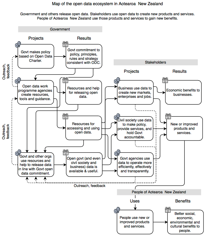
I recently made this map of the open data ecosystem. It is based on the New Zealand context but I expect it is applicable in other countries.

Here is the map as a PDF. The map uses the PRUB approach for validating strategies. I will explain what it shows, working from bottom right to upper left.
The map looks complicated because the ecosystem is complicated
Business, civil society and government organisations create products and services that citizens use to derive all sorts of benefits. Those organisations (I call them stakeholders) can use open data to create new and better products and services. Government and civil society organisations will do that because that is what they do. Businesses will do it if it also makes them a profit. There are many stories about this such as these New Zealand open data case studies.
The left hand side of the map shows the supply side. The main result that government and other agencies create is open data. This map also shows an open data work programme within government, creating resources and help both for releasing and for using open data. Finally, in the top left, the map shows how policy based on the Open Data Charter is used both by the open data work programme and by all government agencies releasing data.
People will only use the things you make if you make things they will use
Of equal if not more importance than the left-to-right flow is the flow in the reverse direction. When one group or individual uses a result created by another, that use is entirely voluntary. If the user does not find the result useful, they won’t use it. Even if they do use it, they might not use it in the way desried by whoever created it. For that reason, anyone creating something had best take a keen interest in how people use it.
The maps shows feedback in four critical places:
- Stakeholders using open data to create products and services for citizens need to understand the needs of those citizens.
- Agencies releasing data need to know the needs of the organisations who use that data – Who are they? What problems are they trying to solve? What data do they need to solve them? How are they getting on with the data that they are using?
- The open data work programme needs to know the needs of government agencies that hold data – Who are they? What motivates them to release data? What challenges do they face releasing data? How are they getting on with the resources and help they are getting from us?
- The policy-makers need to know how the open data work programme and agencies across government are getting on with their policy.
Making use of this ecosystem map
Recently, I was asked to work with Engage2 helping the Open Government Information and Data Programme (OpenNZ) with a consultation about the potential impacts if the Open Data Charter was implemented in New Zealand. Here’s one of the workshops we held.

Extending that process, the map could be used to guide investment in open data market initiatives. Let’s investigate, for example how specific organisations could use certain data sets to create new products or services, and then look at how people could use those to gain benefits. Even using hypothetical instances of that process (an MVP), you could begin to gather evidence to validate a hypothesis. Repeating that would build a dataset you could use to compare opportunities and identify hot spots to investigate further.
I can also envisage using this map to evaluate the impacts of releasing specific data sets, perhaps even for comparing desirable vs undesirable uses. Here is a set of products or services that organisations could build with the data, and some ways people could use those to create benefits or harm. Using evidence to quantify the impacts of those uses, you could assess the overall benefit.
If you can think of other uses of this open data ecosystem map, I would love to hear from you.
One thought on “Mapping the uses and benefits of open data”
Here is a link to the source file for the map above https://drive.google.com/open?id=0Bxofsel6eKnweHJaTnY0YklZVmM
You will need to use http://draw.io to open it.
And you may find I have improved the map since posting the one above.
Comments are closed.